


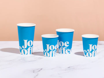


We're thrilled to unveil our new women-produced coffee, The Village, whose label art is just as stunning as the coffee within. As a product that features seasonally rotating coffees from valued relationships with female producers, we hoped to reflect the diversity of stories and perspectives as well as origins in the artwork. We had the privilege of working with the incredible Costa Rica-based illustrator Erica Zeledón Salazar to bring the concept to life.
Based in San José, Costa Rica, Erica studied Art & Visual Communication at the Universidad Nacional de Costa Rica and majored in graphic design. After spending several years working in the advertising industry, she took a leap of faith to forge her own path working full time in illustration. Her work is defined by vibrant colors and texture, along with the use of symbolic elements, connecting her ideas with the natural world around her.
To create the illustration for The Village label, we shared stories with Erica about the women producers we have come to know and whose work we aim to highlight, as well as the larger context of women's significant contributions to the coffee industry. Drawing inspiration from some of the imagery we shared, including the women of the Turihamwe Cooperative in Burundi dancing, Erica anchored the illustration with a woman with welcoming, open hands symbolizing creation and harvest, and intertwined elements of growth and cycles, which are integral to the production of coffee.
We had a chance to speak to Erica about what inspires her work, and specifically the design for The Village. Her answers are presented in Spanish with their English translations.

You mention that nature and the cycle of life are the main themes of your illustration work. What is it about these subjects that inspires you?
Nature has the ability to be a source of constant creation and transmutation—in it, we can find such microscopic elements that are difficult to see with the naked eye, as well as large bodies that make you feel so small—each and every one of them essential and important in the cycles of life. At the end of the day, everything is connected and those connections are what catch my attention completely.
What type of color palette do you gravitate towards and why?
Me suelen gustar los colores primarios y el verde, para mí son el inicio de todo y siento que son “accesibles” a un público más amplio, con esto quiero decir que busco crear ilustraciones que sean de una lectura más “fácil” ya que el detalle de las mismas puede estar cargado de elementos y al usar estos colores busco que no sean “pretenciosas” por ponerlo de alguna manera.
I usually like primary colors and green. For me they’re the beginning of everything and I feel they’re “accessible” to a wider audience. By this, I mean to say that I seek to create illustrations that are “easy” to read so the details can be loaded with elements, and by using those colors, I look for them to not be “pretentious,” to phrase it like that.
How long have you been illustrating, and how have you evolved as an artist over the
I started in the world of illustration 10 years ago and it has been a whole process to be able to understand myself, to know myself to be able to understand what I wanted to achieve as an artist. Besides, we’re in an era of bombardment of styles and trends you’re supposed to follow in order to be seen and taken seriously. That’s why practice and sketching are so important as a source of idea generation beyond looking at external references that can be confusing to us. Looking inward is key to being able to grow, because at the end of the day we are our own most honest source of what we really want to achieve.
When working on the label for The Village, what was your process to create the illustration? (How did you interpret the brief/draw inspiration from the photography we provided, etc)
I think it was key to create an illustration that celebrated the playful part of the coffee harvesting process that could represent a community of women. Likewise, it was important to use essential natural elements in the process of growth of the coffee plant, such as the birds who are agents of pollination, in addition to what is necessary: the sun as both a source of vitality and a symbol of the cycles of life.